• We are looking for you!
    Always wanted to join our Supporting Team? We are looking for enthusiastic moderators!
    Take a look at our recruitement page for more information and how you can apply:
    Apply

Interface Improvements Feedback

UBERhelp1

Well-Known Member
The collapsing menus don’t drive either of those metrics and only increase the click counts per user per day. I come from a PKI developer background and extrapolated the click count data reason which is important for identifying attacks on the envelope in my field. What metric are they going after with either the collapsing quests and the buff bar ? I say and and not or because of the way they were introduced simultaneously so they appear to be a heads or tails on the same coin scenario. Your response is credible but doesn’t account for the latest changes. They were pushed as improvements but the lack of user input in the decision or development process clearly indicate that user experience was not a concern during either process. Any insight into this would be greatly appreciated as the company obviously will be keeping these monstrosities unless the revenue generating user attrition rates cross some threshold that only they know.
They aren't going after any metric in this specific case - they're trying to make a cleaner interface for players on smaller screens. It's extremely cluttered on mobile, so by having collapsible elements, you can still have the info easily accessible, but not have it coving up what little real estate you've got on screen.

Now, the daily login bonus? You can bet that's working to try and increase the DAU. Active players will probably log in anyways, but for newer players who get free resources? That'll probably help out a little bit

 

Sharmon the Impaler

Well-Known Member
They aren't going after any metric in this specific case - they're trying to make a cleaner interface for players on smaller screens. It's extremely cluttered on mobile, so by having collapsible elements, you can still have the info easily accessible, but not have it coving up what little real estate you've got on screen.

Now, the daily login bonus? You can bet that's working to try and increase the DAU. Active players will probably log in anyways, but for newer players who get free resources? That'll probably help out a little bit
Hopefully they pay attention to the PC user's reactions who generally have 19-27" diagonal screen real estate to work with. They made the buff bar useless and it even hides the disconnected building warning which degrades the player experience with no benefit.
 
Last edited:

Sharmon the Impaler

Well-Known Member
The problem only arises when it’s used. If you have Kraken , HC , SC and BG charges all happening at the same time you need to select each one individually and it closes after each time any one of them is used. I hope you can see how this would be very undesirable for a PC user.
 

Orius Maximus

Well-Known Member
They aren't going after any metric in this specific case - they're trying to make a cleaner interface for players on smaller screens. It's extremely cluttered on mobile, so by having collapsible elements, you can still have the info easily accessible, but not have it coving up what little real estate you've got on screen.

Now, the daily login bonus? You can bet that's working to try and increase the DAU. Active players will probably log in anyways, but for newer players who get free resources? That'll probably help out a little bit

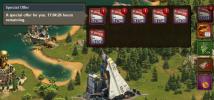
As a mobile player, I say these changes did NOT improve the experience at all, quite the opposite.

The event icon is now to the left of these interfaces on the right, which takes up MORE screen space. Plus whatever annoying ass oversized pointer icon gets stuck to the left of THAT once the event first drops.

The quest interface now has to be closed with a button all the way over on the far side of the screen. Plus there's no indication progress on DCs until you open the interface, and we're guessing the same will be true of event quests. This whole interface worked fine the way it was, so it's coming off as a needless cosmetic change for its own sake, and I'm damn tired of software doing that.

The collect all button was moved to the lower left when it probably could have just stayed on the right where it was. Unless there wasn't enough room for all those crappy purchase offers Inno keeps pushing to me every other day with collect all there and the two new additions. Worse, it occurs to me they might have broken the quest interface to make room for the collect all button!

The buff bar itself is fine, but it kind of sucks how it doesn't stay open. Tapping anywhere on the screen closes it, and you can't tap on the icons to see what they are.

So for the sake of a botched buff bar, and a daily reward feature useful mostly to new cities, Inno has worsened the entire mobile interface and made things more user-unfriendly.
 
Last edited:

FluffyPhoenix

Active Member
I hate the daily quest being hidden. Make it visible while available/active and hide it after it's done. I find myself doing fewer now because the button isn't there while the main quests that I cannot/will not do linger on my screen being useless.
 

PJS299

Well-Known Member
Clicks per day? Is that like how google used to work? Websites/search results were ordered by how many other websites have links to it? I thought it was something like that...
 

Sharmon the Impaler

Well-Known Member
Clicks per day? Is that like how google used to work? Websites/search results were ordered by how many other websites have links to it? I thought it was something like that...
Clicks per day much like the familiar SEO metric of a website but by each user not by website so you can track user engagement. EG if the user logs in and collects then stays logged in and goes to work then this would show as very poor user interaction. Closer to the cousin of clicks per day actually , clicks through. This is when a user lands on your home page either through a search result or backlinks on another site and then clicks on the links or navigation objects (menu , top bar , etc.) to peruse your site showing engagement and interest of the user.
 

Portia the Benevolent

Active Member
Yes! It is super annoying to have to go all the way back into the quest tab to see if the individual task or the quest has completed
It’s just created a bunch of extra steps and the city is so cluttered now you can’t see parts of it. Why the giant red X to click out of the bad quest set up when all you need to do is click anywhere in the city? Why?
 

Ebeondi Asi

Well-Known Member
I play PC, So I have no complaint about any of the change. i still see the full three (with event) left side stuff. The right side used to be a line of items but only five could show, so if I wanted a different one I had to scroll it down. Now I just click and all of that type show. OK by me.
This reminds me of The GE 5.. Endless quitters going to quit, endless complaints. fast forward, about half of my three Guilds are finishing GE 5 and players are proud they can finish it fighting, or getting close to finishing it fighting. So a big win for Inno on the once "horrible" GE 5 . Ge 5 makes GE much more interesting.
So much so, all the complaints are more something changed and I hate it (change) vs something is really wrong. No wonder management ignores the Forums. Jeesh.( I apologize for whining, Ranting all this out.. LoL)
o_O
 

Dominator - X

Well-Known Member
"...Now, all buffs of the same type are grouped together. Clicking on it, you will see all your current buffs of the same type."

This is not a bad idea, but to actually improve it, make it so when you click on the top icon and and all the like icons show up, allow us to click on a specific icon/charge and then leave that one on top. So that way, if you are wanting to collect from your BG, you click on the BG icon and the amount of charges left for the BG will be the top icon and always visible until you either use all your charges or you select a different icon.
 
Top